Food pyramids act as a guide to help people make healthy food decisions by displaying visually the importance of particular food groups within a balanced diet. While there have been several variations over the years, the underlying recommendations have remained relatively unchanged. However, recent developments by the United States Department of Agriculture have made some drastic changes in both appearance and nutritional content.
History of the Pyramid
The first known instance of a food guide pyramid was from Sweden in 1972. It was designed in response to rising food costs in the country and attempted to provide citizens with guidelines for finding affordable healthy foods. This pyramid prototype set the standard for placing the most essential staples (grains and potatoes) at the bottom and supplemental foods (fruits, vegetables, meats, and fats) at the top.
The most widely recognized food pyramid was developed by the USDA in 1992. It was divided into six sections, and like the Swedish model, it placed the most essential, healthy foods that required the most servings near the bottom, while foods which should be eaten more sparingly were placed near the top.
The USDA food pyramid used pictures to indicate common foods that fell within the particular food groups and had a system of circles and triangles to indicate which of these were high in fat and sugar, respectively. In 2005, the USDA rebranded the food pyramid as MyPyramid and updated the layout so that each food group spanned the pyramid from the top to bottom. The organization also added a person climbing the pyramid to indicate that physical activity was just as essential for a healthy lifestyle.
The Current Pyramid
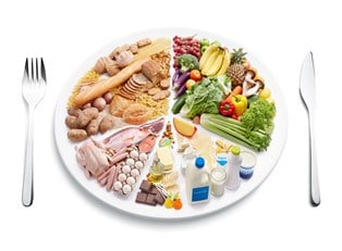
In 2011 the USDA actually did away with the food pyramid entirely and replaced it with MyPlate. Like its predecessor, MyPlate relies on visual cues to indicate the relative importance of a food group in a person’s diet, but instead of the classic pyramid shape, this guide now uses a common dinner plate. Grains and vegetables are deemed the most important components of a meal, so each takes up 30% of the plate. Fruits and protein each occupy 20%, and dairy is represented as a small glass to the right of the pyramid.
Supporters of MyPlate have lauded it as less confusing than the original food pyramid, because citizens can more easily compare the makeup of their meal plate to the infographic. However, some have criticized this setup, since fats and oils have been completely eliminated. Critic argue that this could potentially lead to some people consuming too much of them. To help ease some of this confusion and provide people with more detailed nutritional information, the MyPlate website provides additional tips for eating a balanced, healthy diet.